Curtains do more than cover windows — they influence light, mood, and the overall style of a space. One of the most common questions we get from our clients is: what color curtains should I choose to go with my wall color? Here’s a simple and effective guide to help you create a well-balanced and cohesive look.
Key Principles for Coordinating Curtain and Wall Colors
- The 60-30-10 Rule
- Use 60% of your space for the main color (usually walls), 30% for a secondary color (like curtains), and 10% for accent tones (pillows, throws, decor). This balance helps create visual harmony.
- Contrast or Blend?
- Complementary colors (opposite on the color wheel) create bold contrast, while analogous colors (next to each other) give a softer, more relaxed look.
- Material and Texture Matter
- Even if your curtains and walls are similar in color, different materials (e.g., matte wall paint + velvet or linen curtains) add dimension and style.
- Light or Dark Curtains?
- Light-colored curtains can open up a space and make it feel brighter. Darker fabrics bring warmth and intimacy, especially in larger or high-ceilinged rooms.
Curtain Color Recommendations by Wall Color
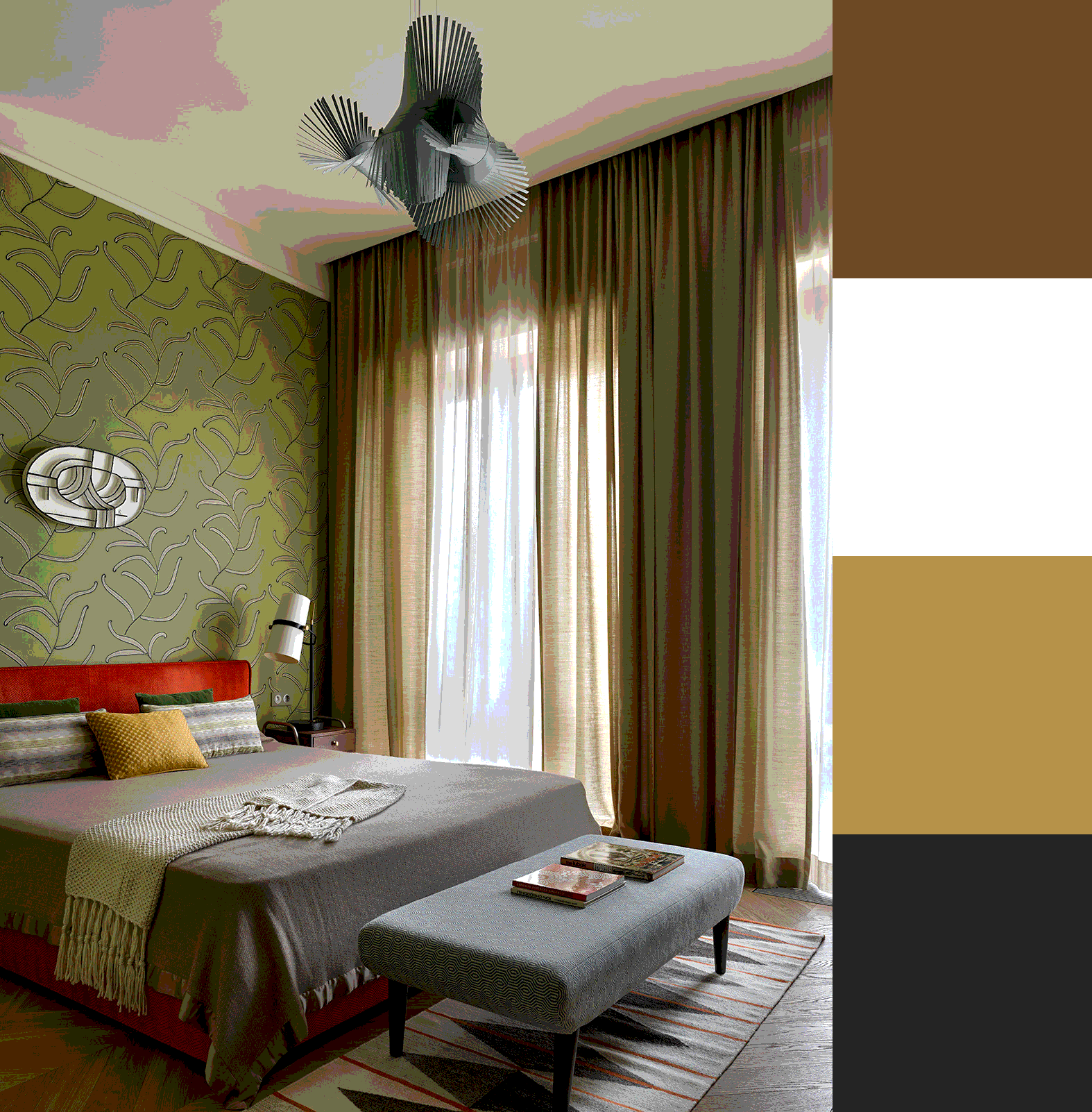
🟩 Green Walls
Highlight a natural, calming vibe with earthy tones like beige, brown, or a deeper shade of green. For contrast, try burgundy or plum for a rich, elegant look.
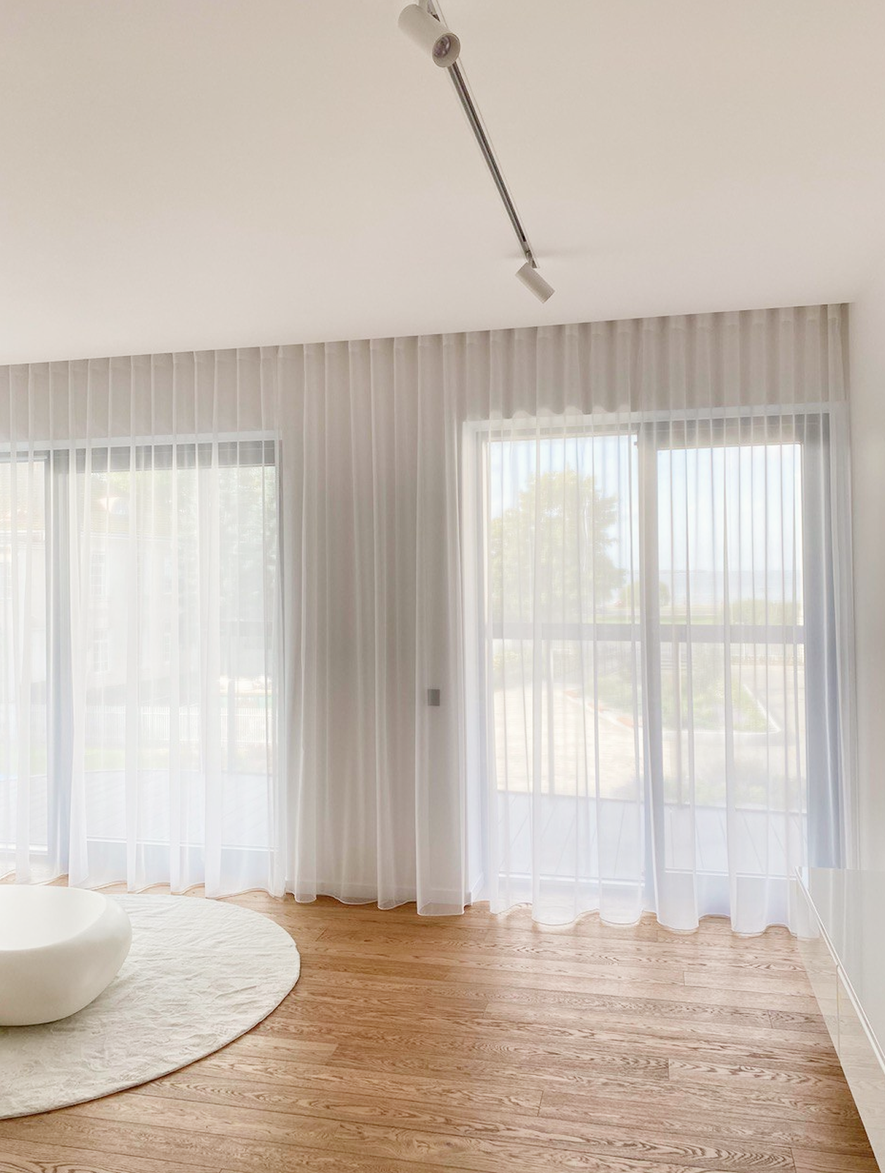
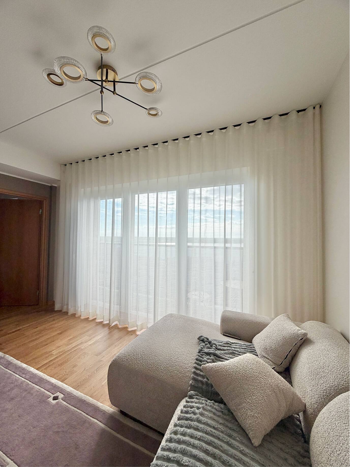
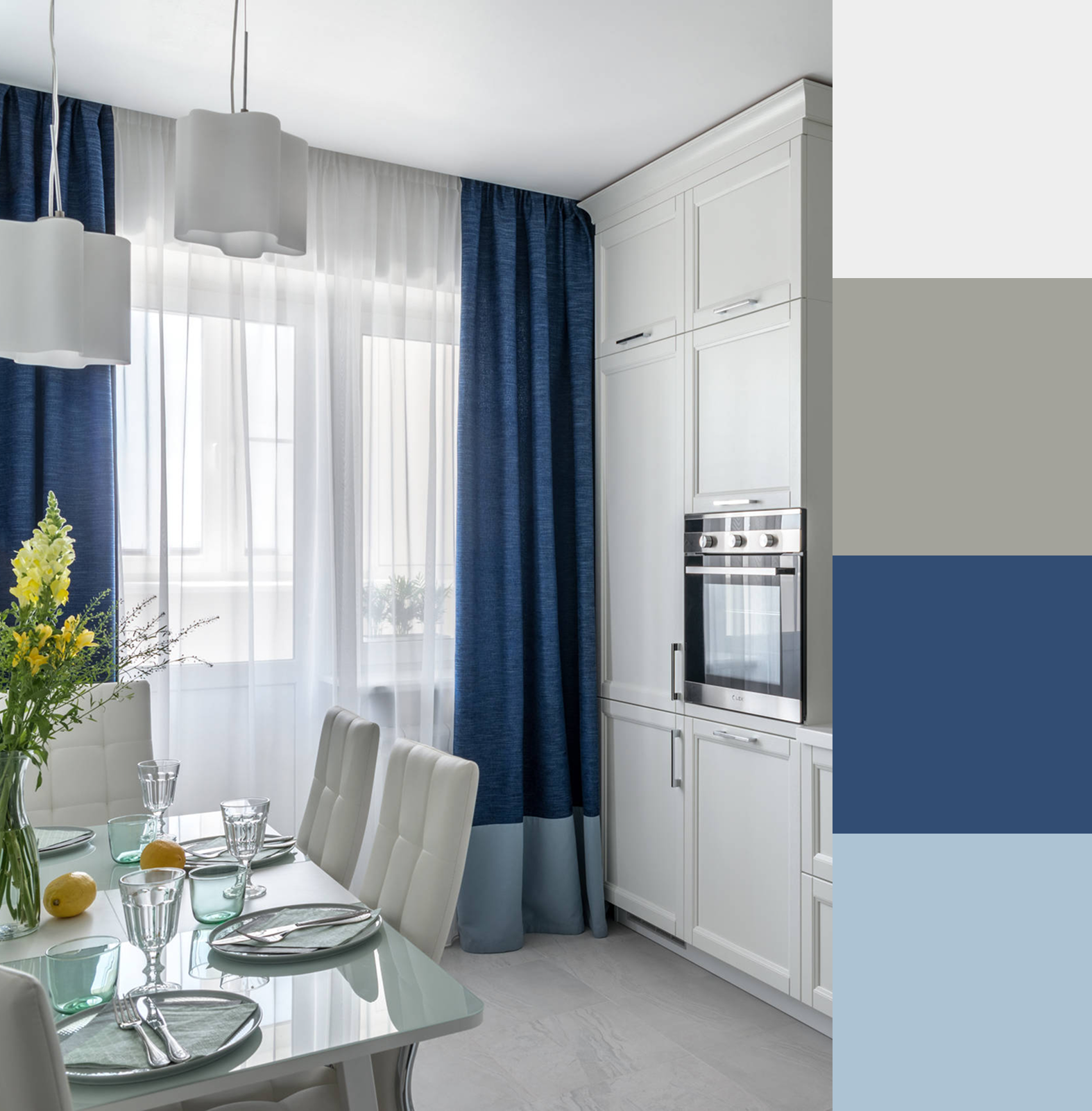
⬜ White Walls
A versatile backdrop. Light grey or white curtains maintain a clean, airy atmosphere. For softness, go with pastels. For bold contrast, opt for deep navy, charcoal, or black.
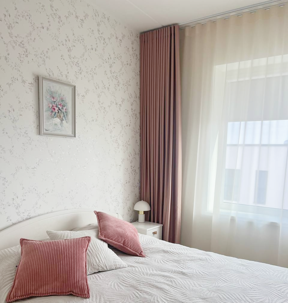
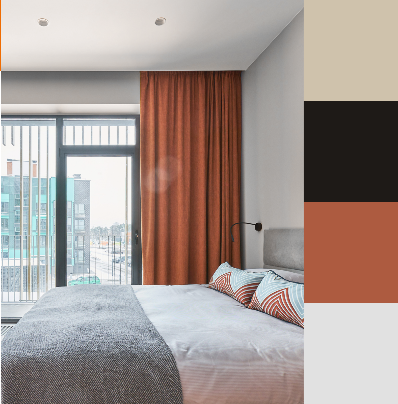
🟨 Cream and Beige Walls
These warm neutrals pair well with rust, dusty rose, or olive green. If you're aiming for something more dramatic, try deep navy or burgundy for a luxurious touch.
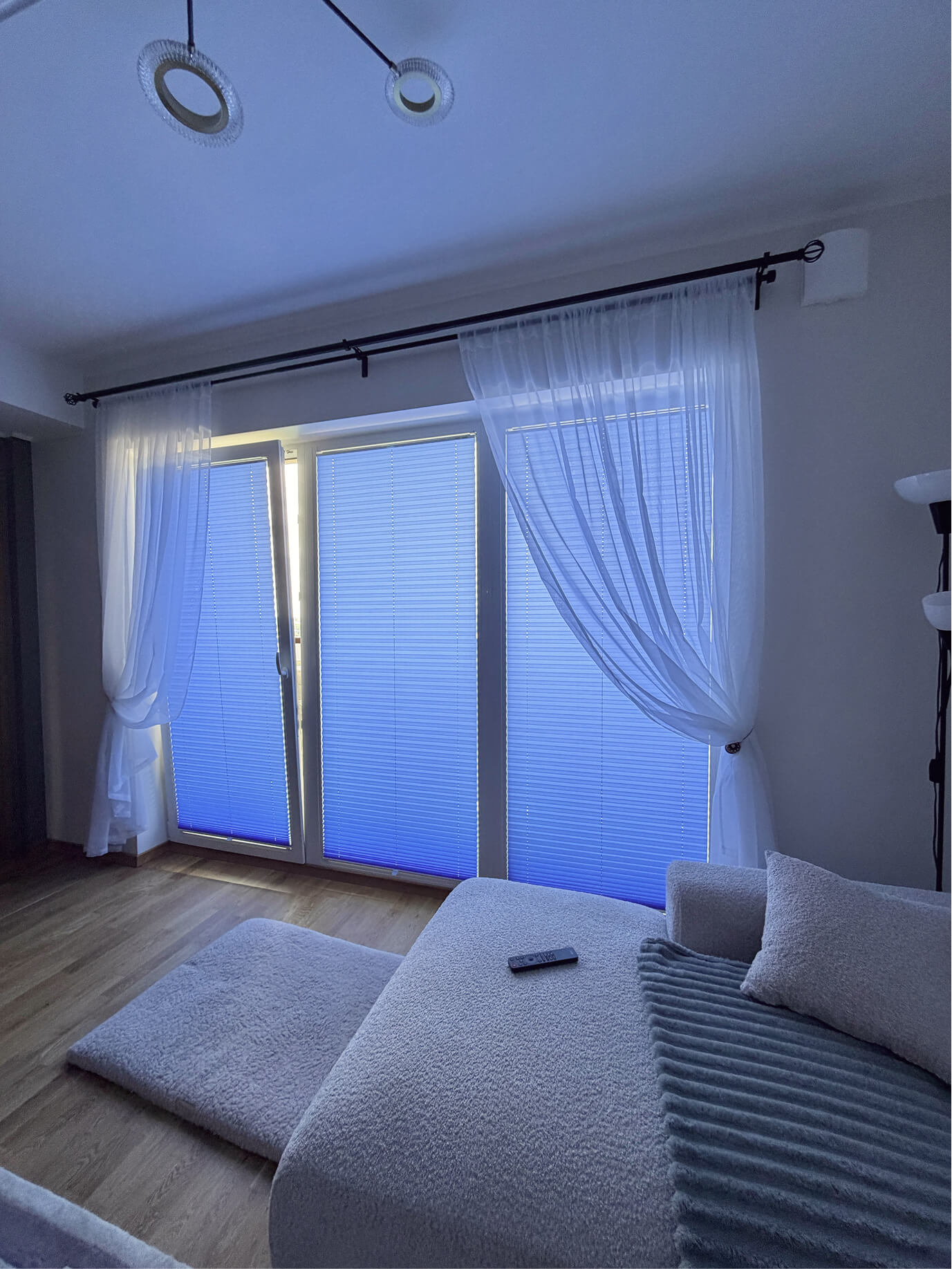
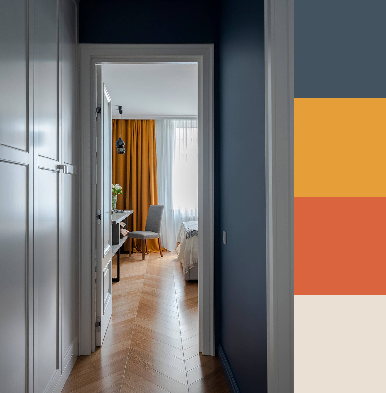
🟦 Blue Walls
Go tone-on-tone for a calm, cohesive effect with other shades of blue. To warm up the space, try mustard, sand, or terracotta.
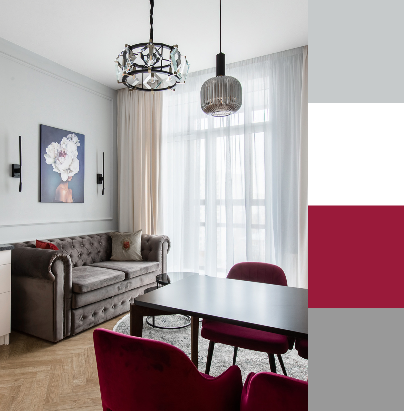
⬛ Grey Walls
Grey is incredibly flexible. Create contrast with white, black, or warm brown. For a softer vibe, go with light blue, blush pink, or café au lait tones.
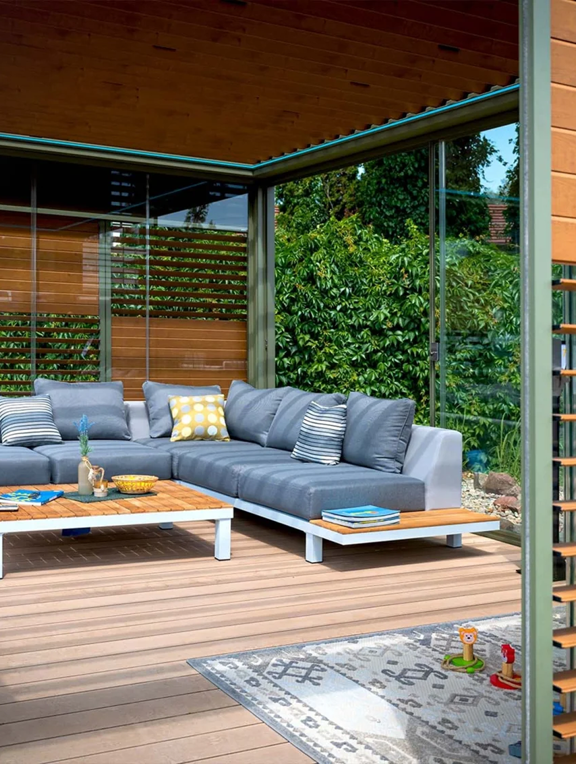
🟫 Dark Walls
Perfect for larger rooms. Use light-colored curtains to balance the space and avoid a heavy feel. If you prefer dark curtains, go for elegant fabrics with a slight sheen or texture to add depth.
Why Curtain–Wall Color Harmony Matters
- A Calm and Balanced Space
- When curtain and wall colors are thoughtfully matched, the room feels complete, comfortable, and well-designed.
- Visual Effects
- Light tones open up the room, while darker ones add coziness and depth.
- Reflects Your Style
- A well-coordinated palette shows attention to detail and good taste — and it doesn’t go unnoticed.
Not Sure What to Choose? We’re Here to Help.
At Motiva, you can book a free home visit with our textile decorator. We’ll bring fabric samples, take lighting and room layout into account, and help you choose curtain colors and materials that truly fit your home.
Curtains are not just fabric — they set the tone of your space.
And we’re here to help you create the feeling you want.